CI (Corporate Identity)
-
Brand Mark(Wordmark)
-
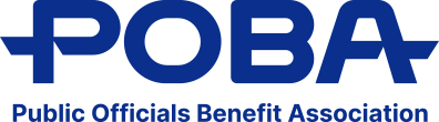
- The brand mark highlights the English acronym "POBA" in a wordmark format. It acts as a central connecting point between members and the association, serving as the primary visual identity across all brand touchpoints.
-
Design Concept
-
-

- Companion
- A lifelong companion, securing your future
-

- Connection
- Connection of continuity and mutual growth that meets members and links today with tomorrow
-

- Soar
- Wings of flight soaring upward Uplifting the value of life, not settling, but leaping toward a better tomorrow
-
-
Logotype
-
Korean
- Full official name

- Abbreviated name

English

-
Emblem Variations
-
-
- A-1
-

- A-2
-
- A-2
-

- A-4
-
-
Design Evolution
-
POBA's Corporate Identity has evolved over time to reflect the institution's growth and changing values. It stands as a visual representation of both its current identity and its aspirations for the future.
-

- 1995
Introduced the original CI - an abstract symbol combined with the institution's Korean name.
-

- 2007
Updated to emphasize the English acronym "POBA" aligning with a broader trend toward English branding.
-

- Post-2007
Transitioned to a wordmark that more directly represents local government officials.
-

- 2025
Latest redesign highlights distinct symbolism representing both POBA and its members, differentiating it from other benefit associations.
-
-
Design Award
-
-

- Chicago Good Design Award
-

- German Design Award
-

- Global Design iT Award
-